Seed,
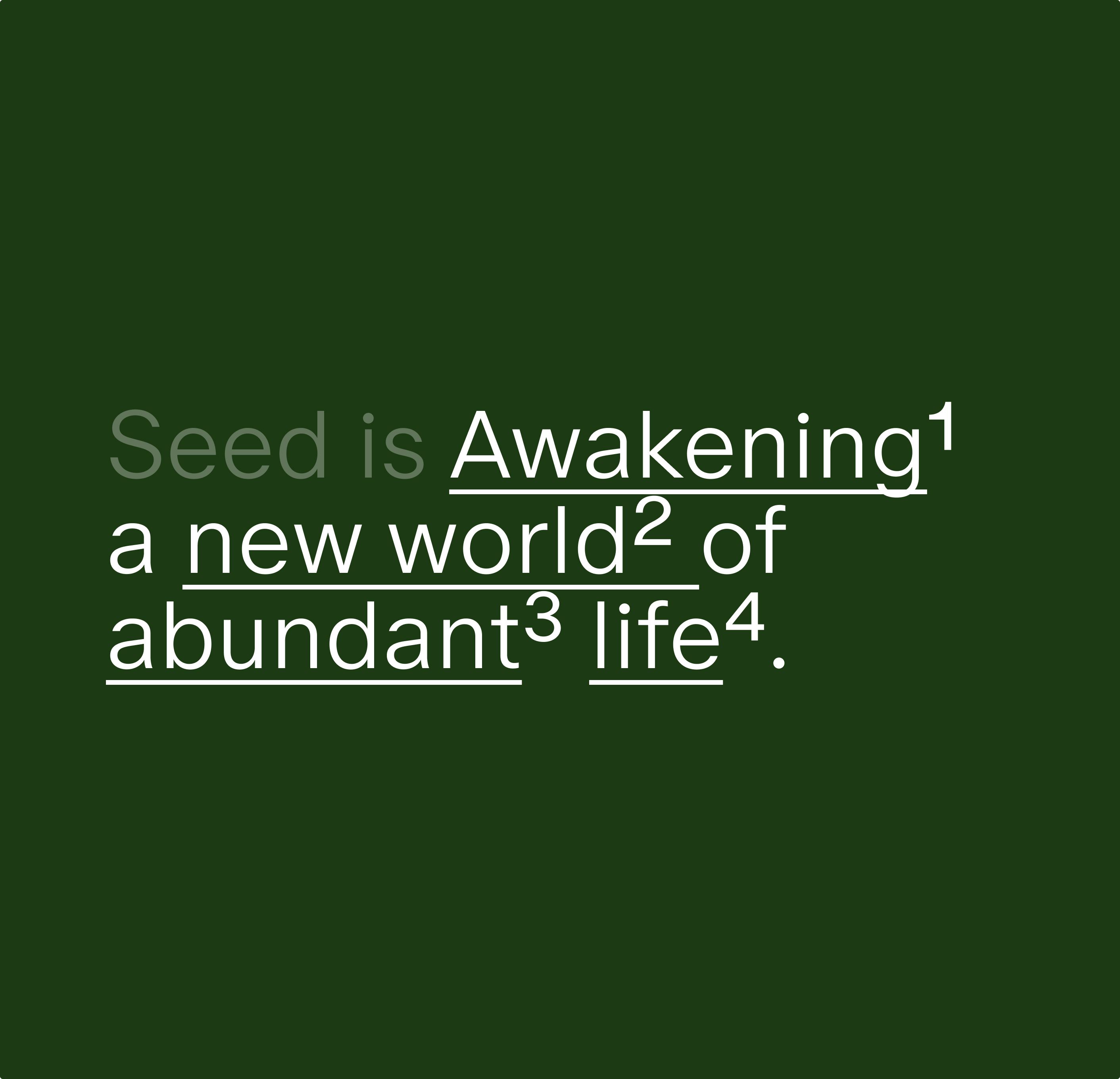
Awakening a new world of abundant life.
Client:
Seed
Year:
2024
Role:
- Strategy
- Creative Direction
- Visual Identity
- Motion Design
A brand evolution inviting all of existence to Come to Life.
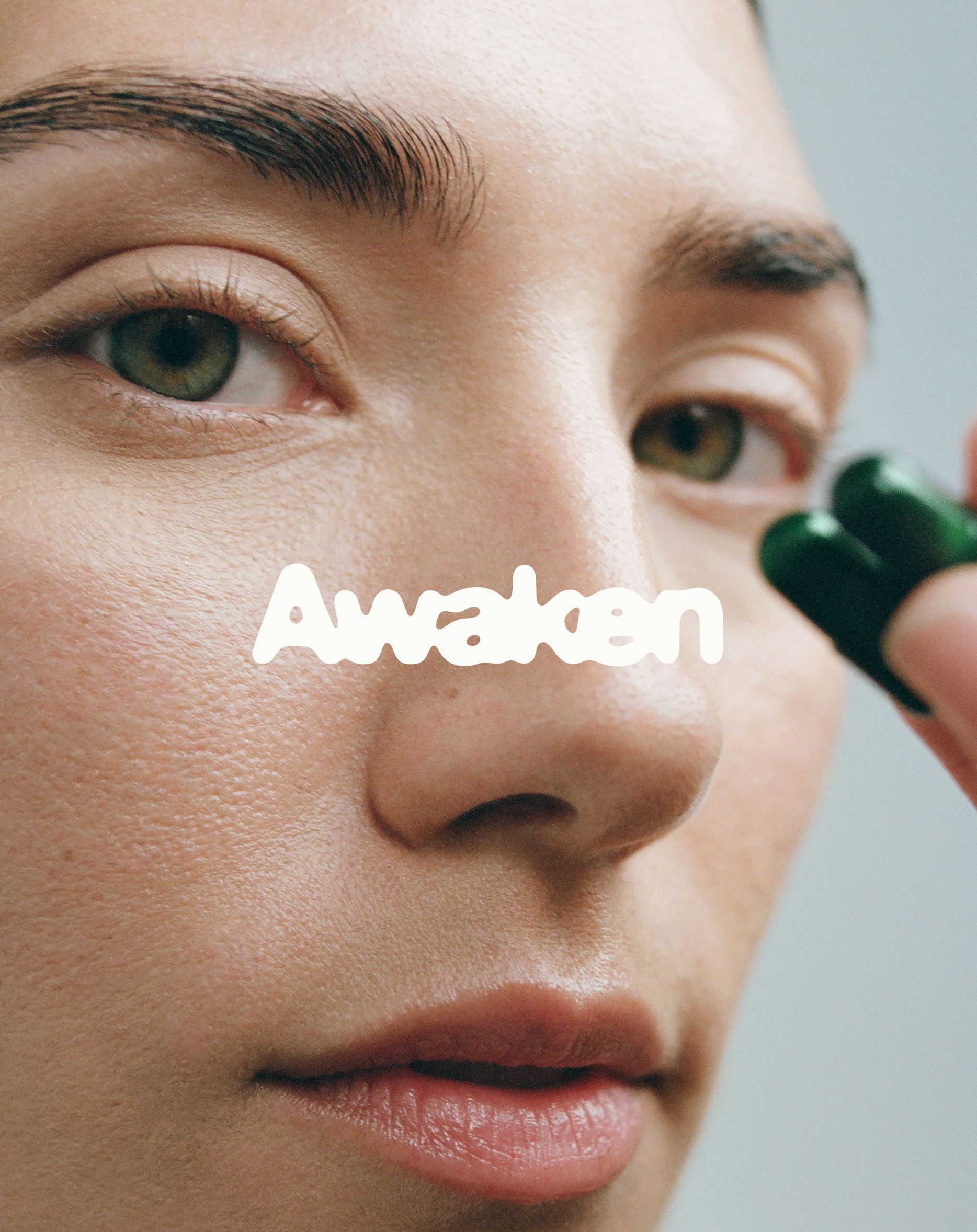
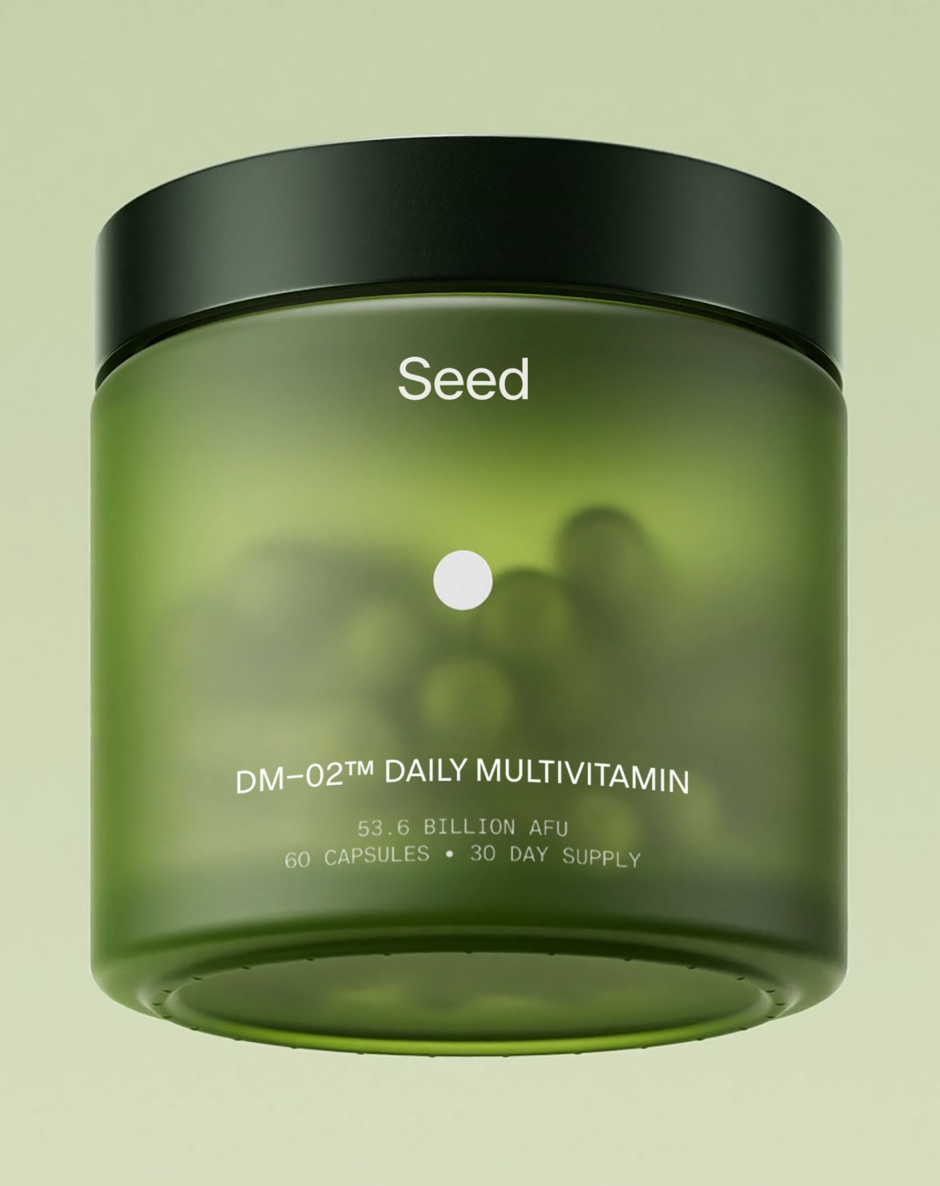
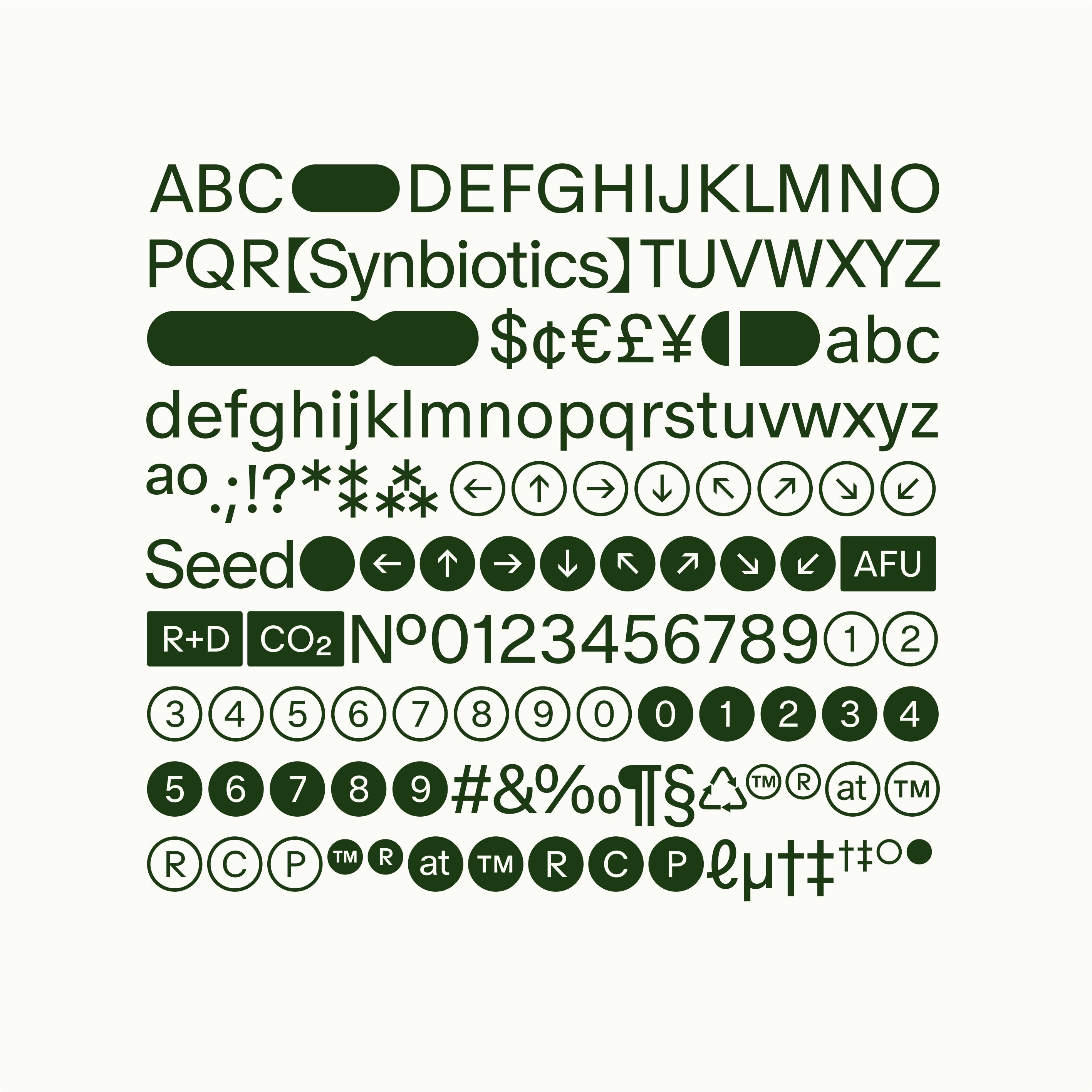
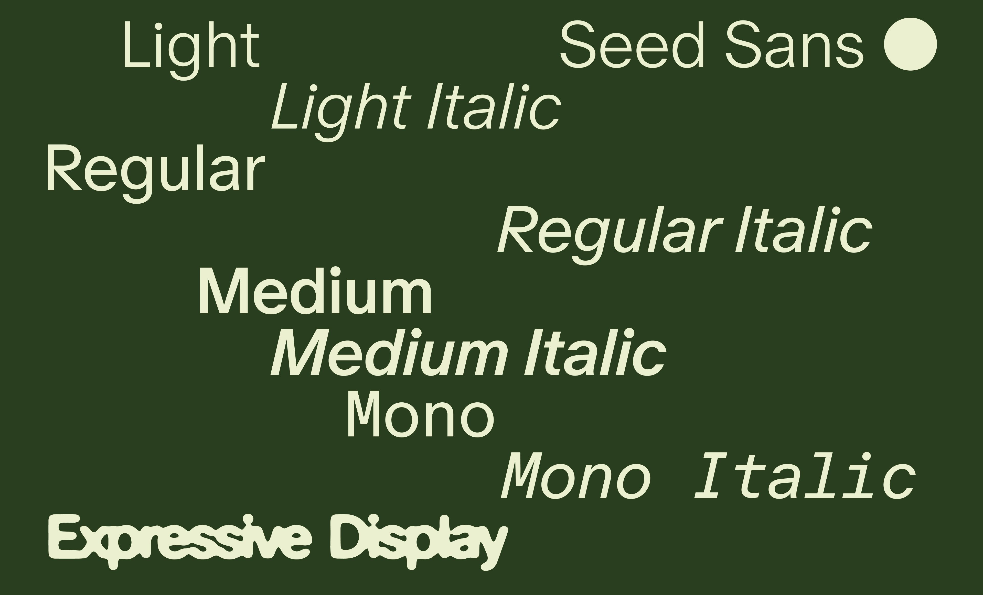
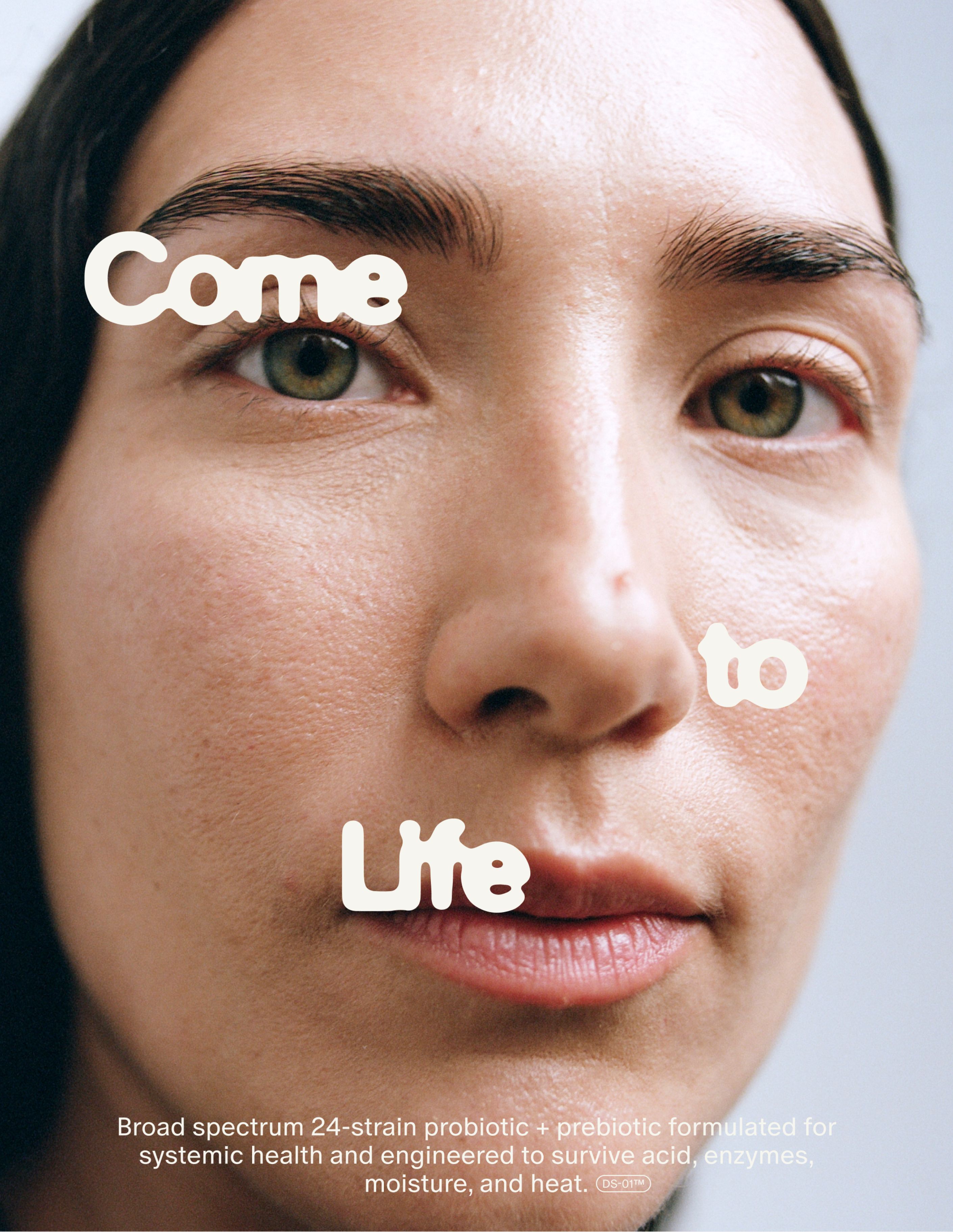
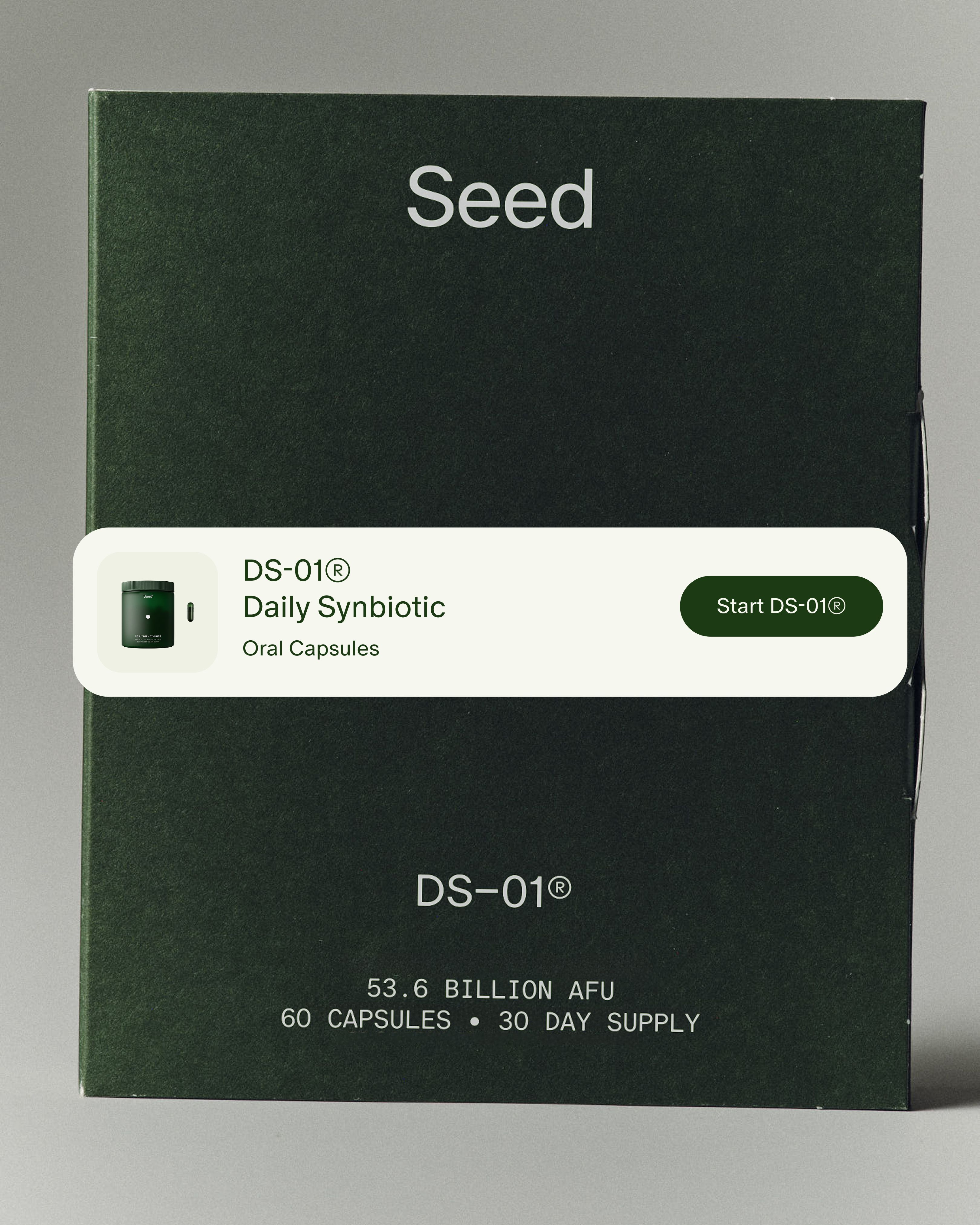
Unique, fluid typography that flexes between scientific precision and human expressiveness.

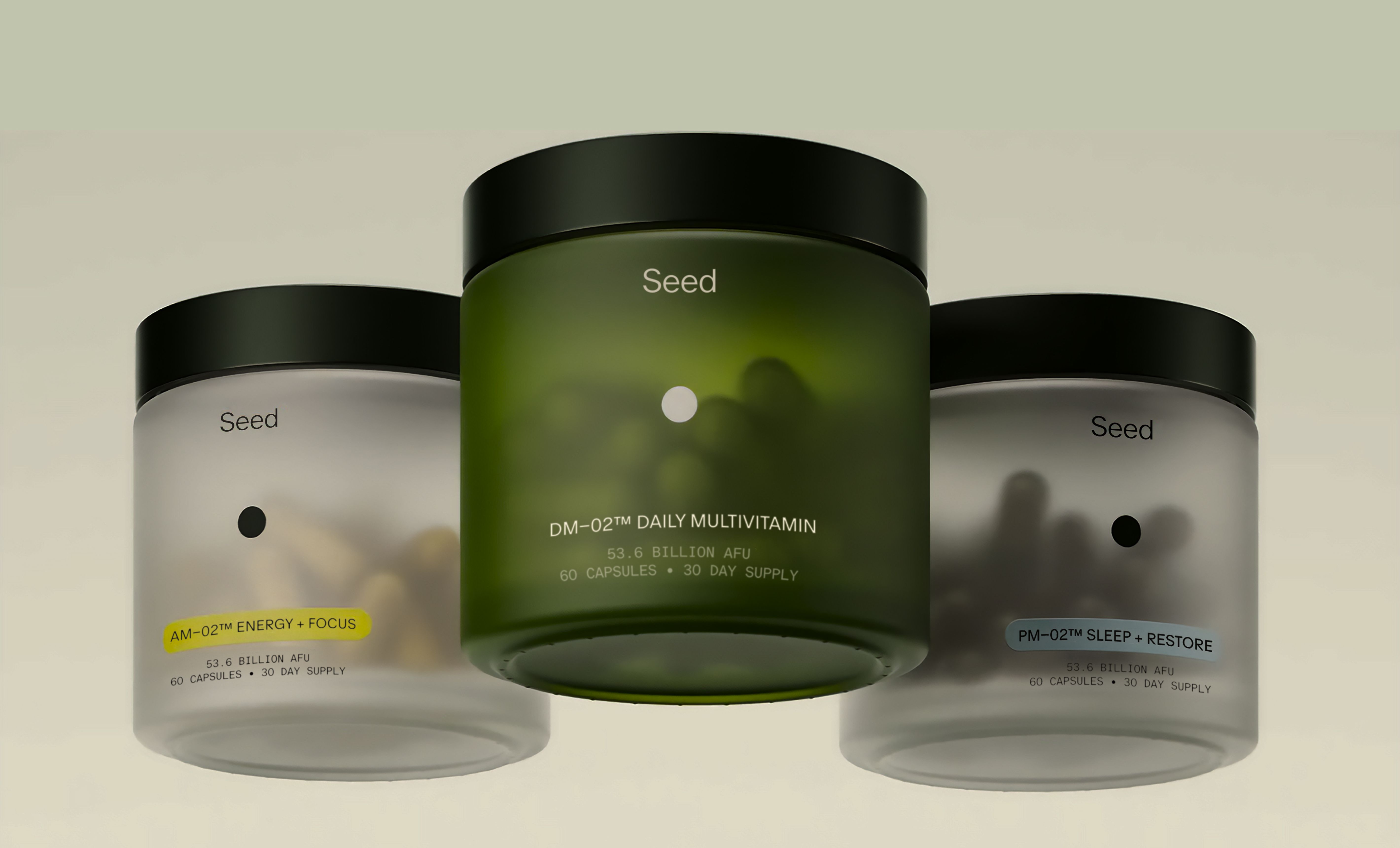
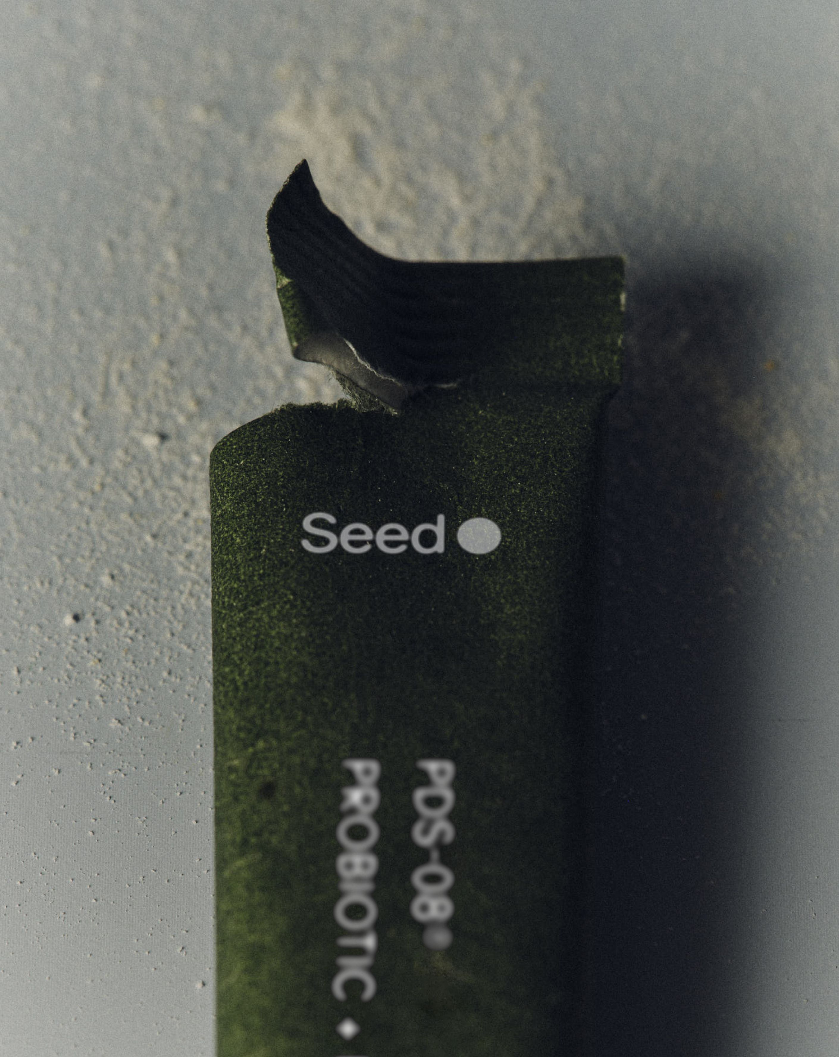
Shades of science and nature, enduring as life itself.


Movement inspired by nature's growth curve.
A brand system built to meet the moment



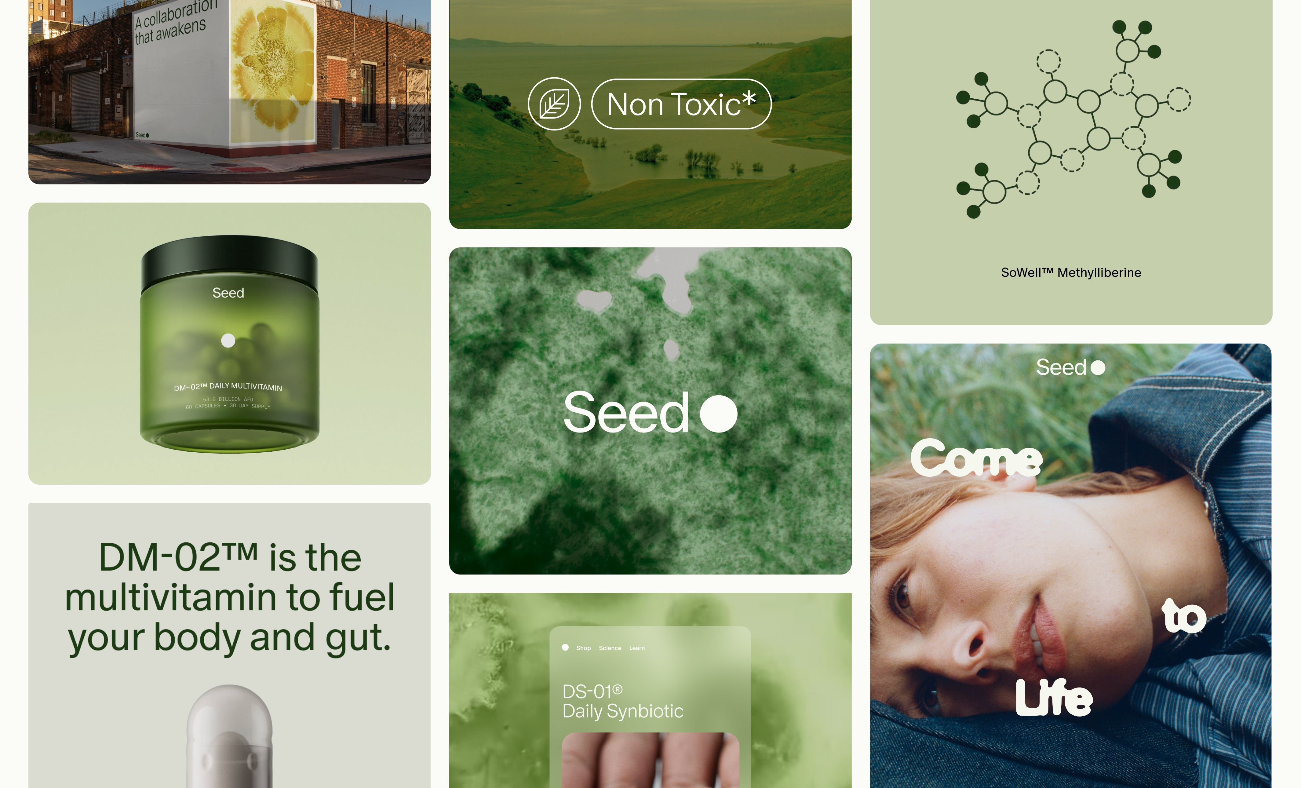
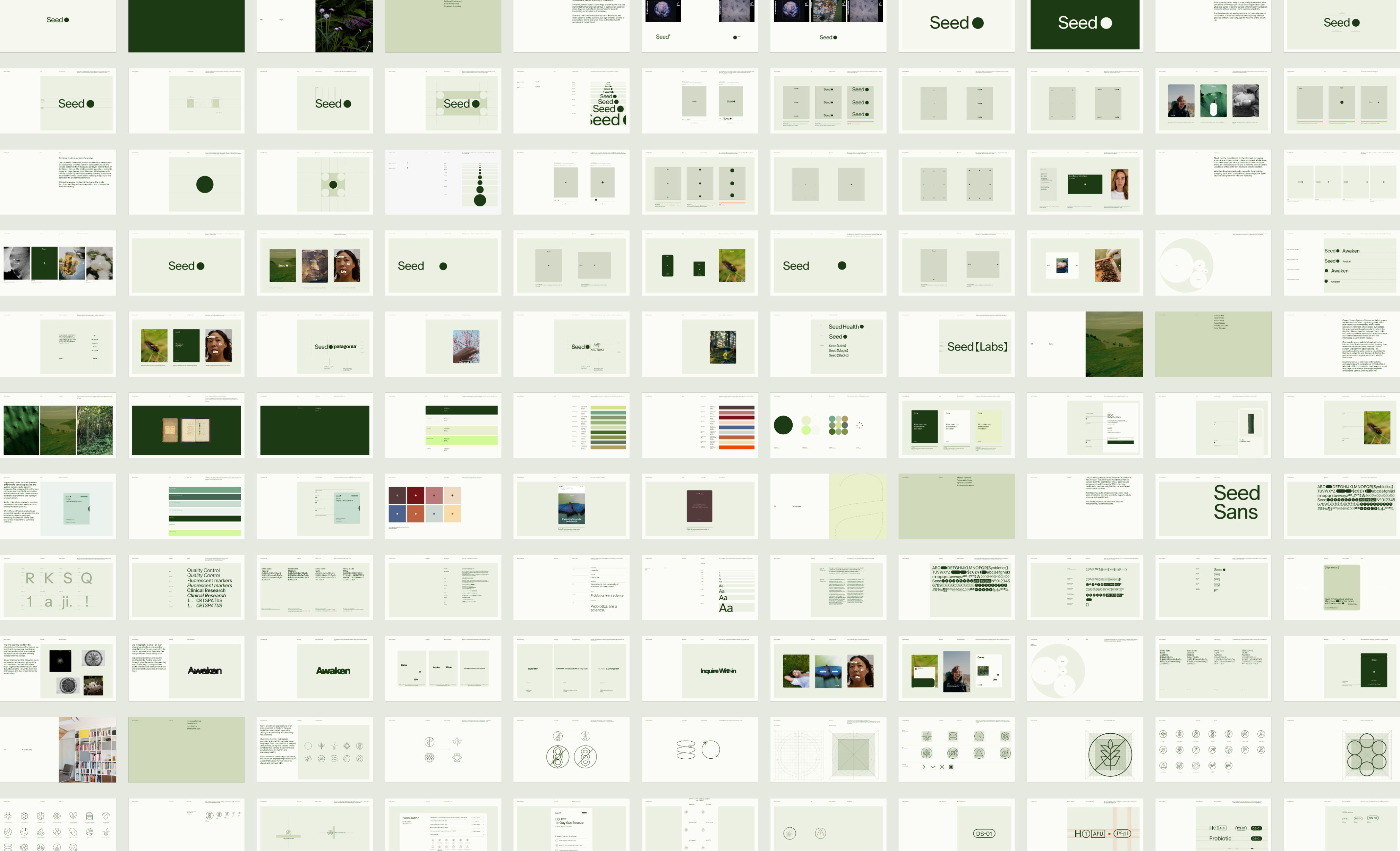
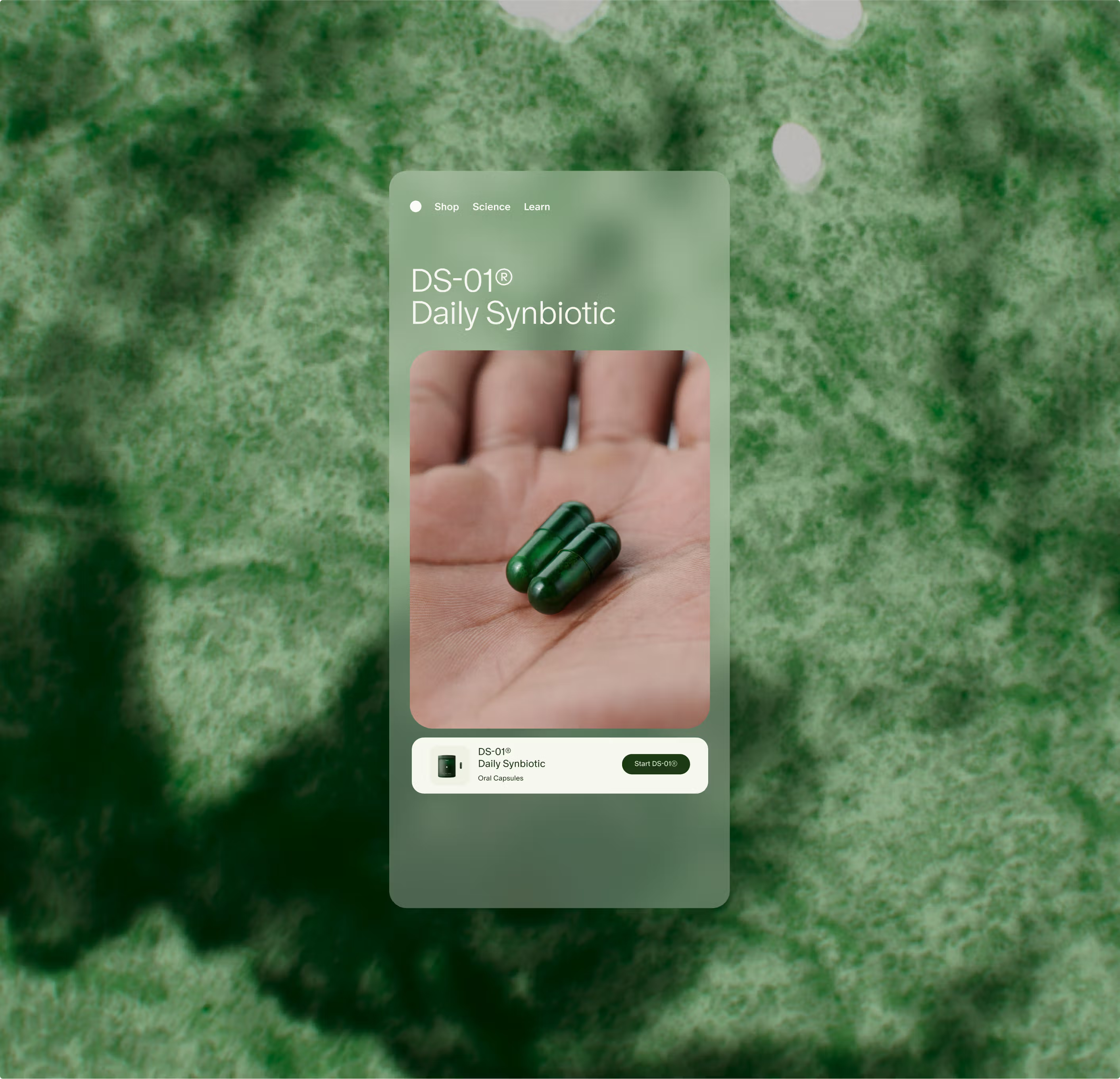
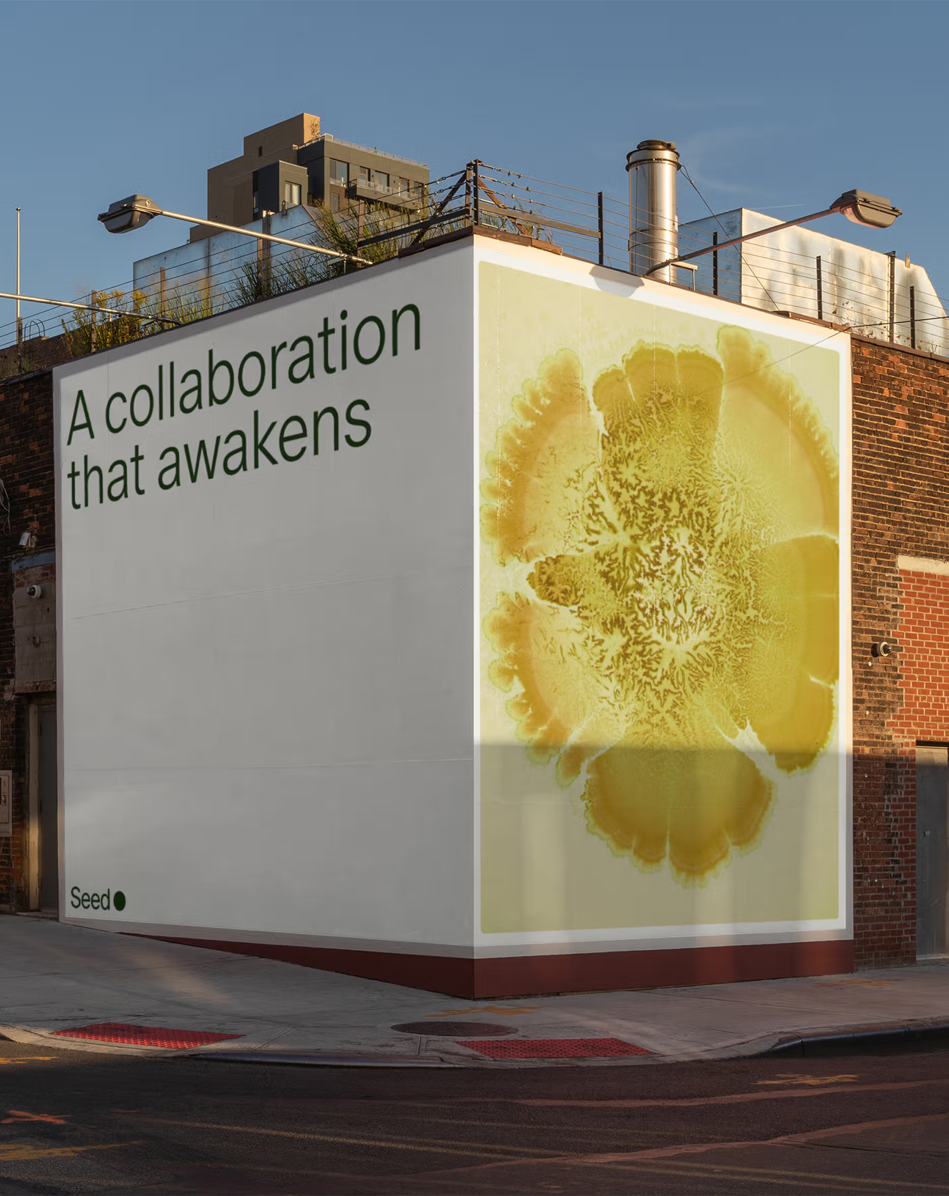
Seed is a pioneering health company built on the science of the microbiome. Since launch, it has played a defining role in making scientific innovation understandable and beautiful for everyday life. After six years of shaping the cultural conversation around microbes, health, and planetary well-being, the team approached us with the challenge of evolving the brand system to support a growing ecosystem of products, audiences, and touchpoints—without losing the spirit that made Seed stand out.
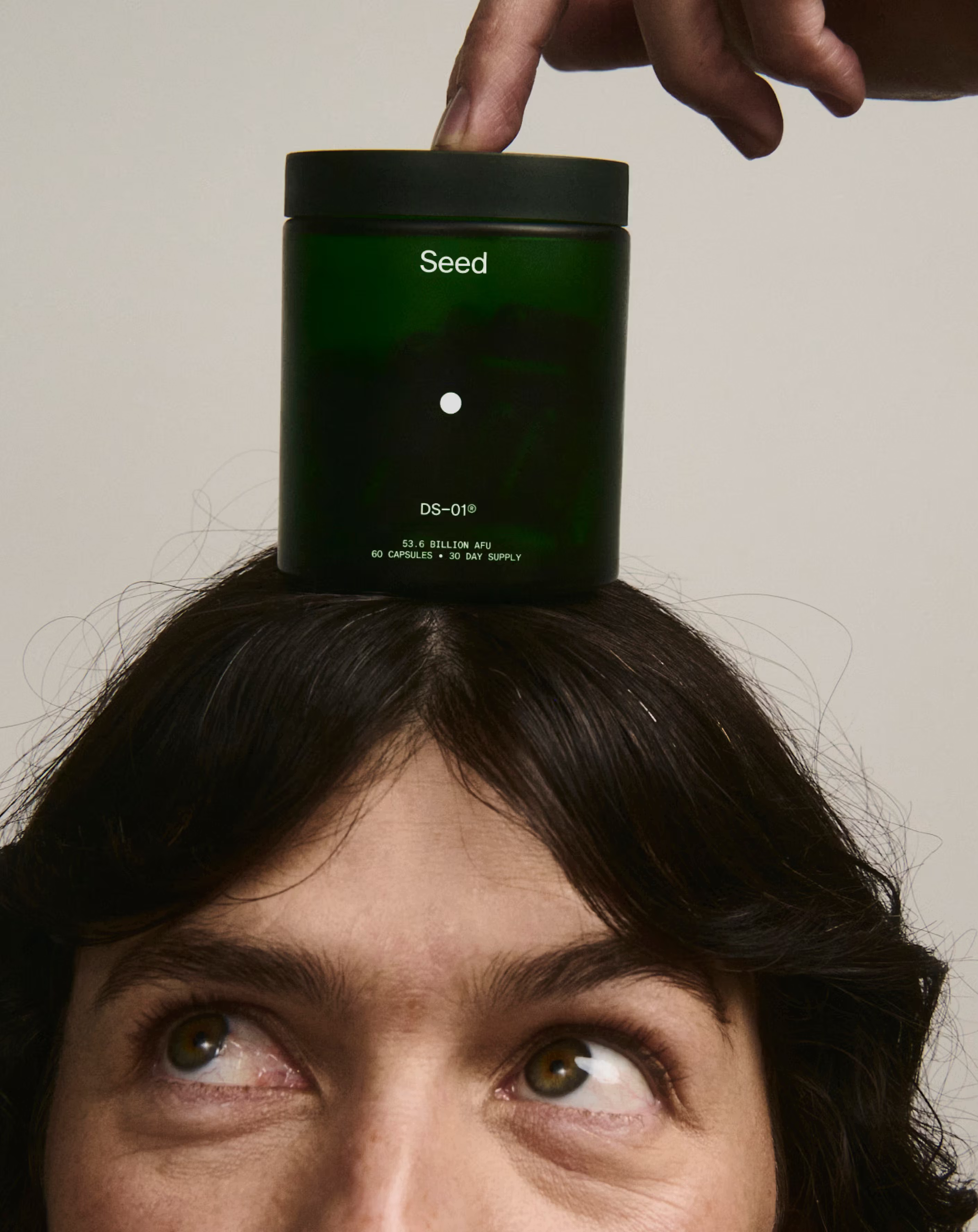
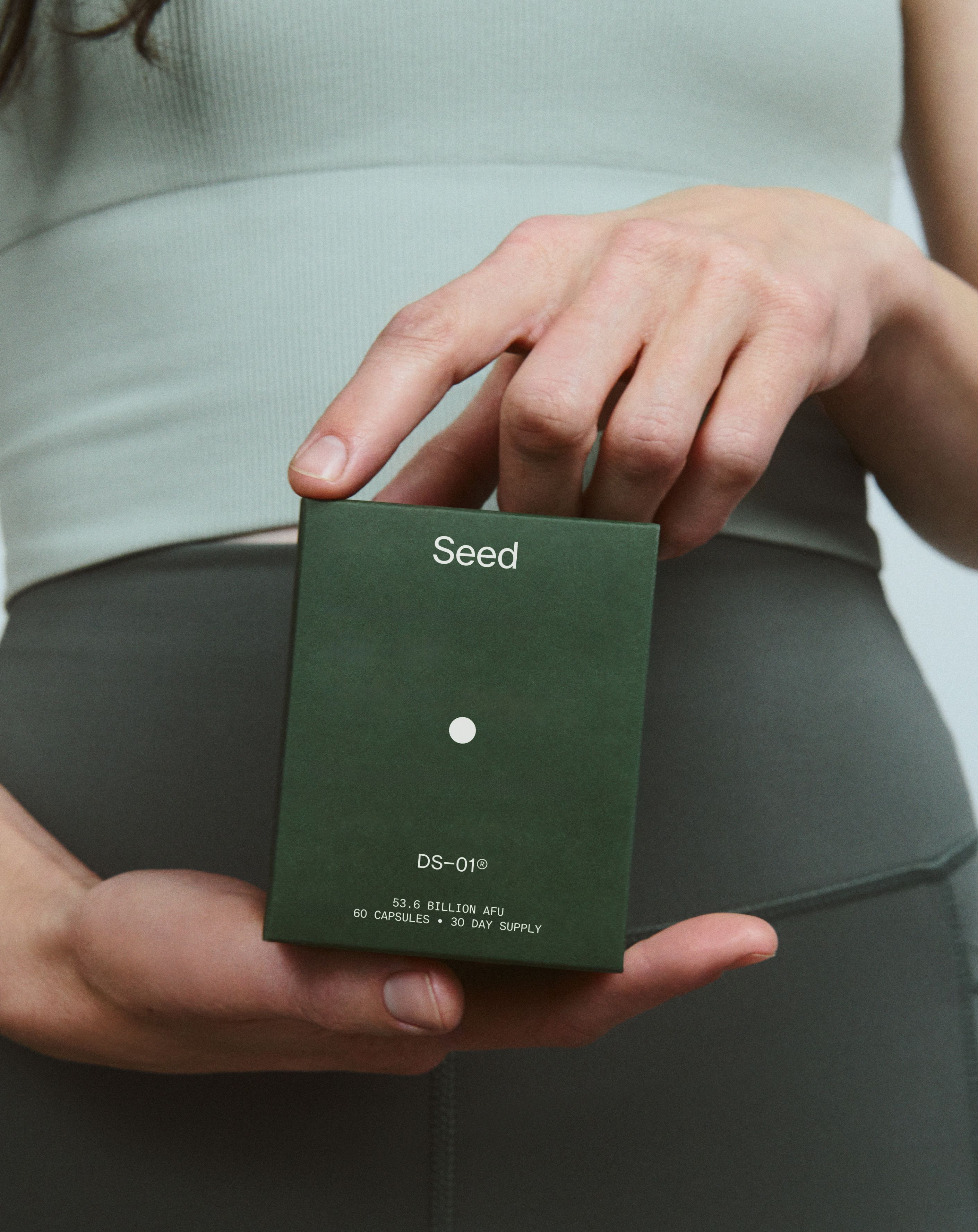
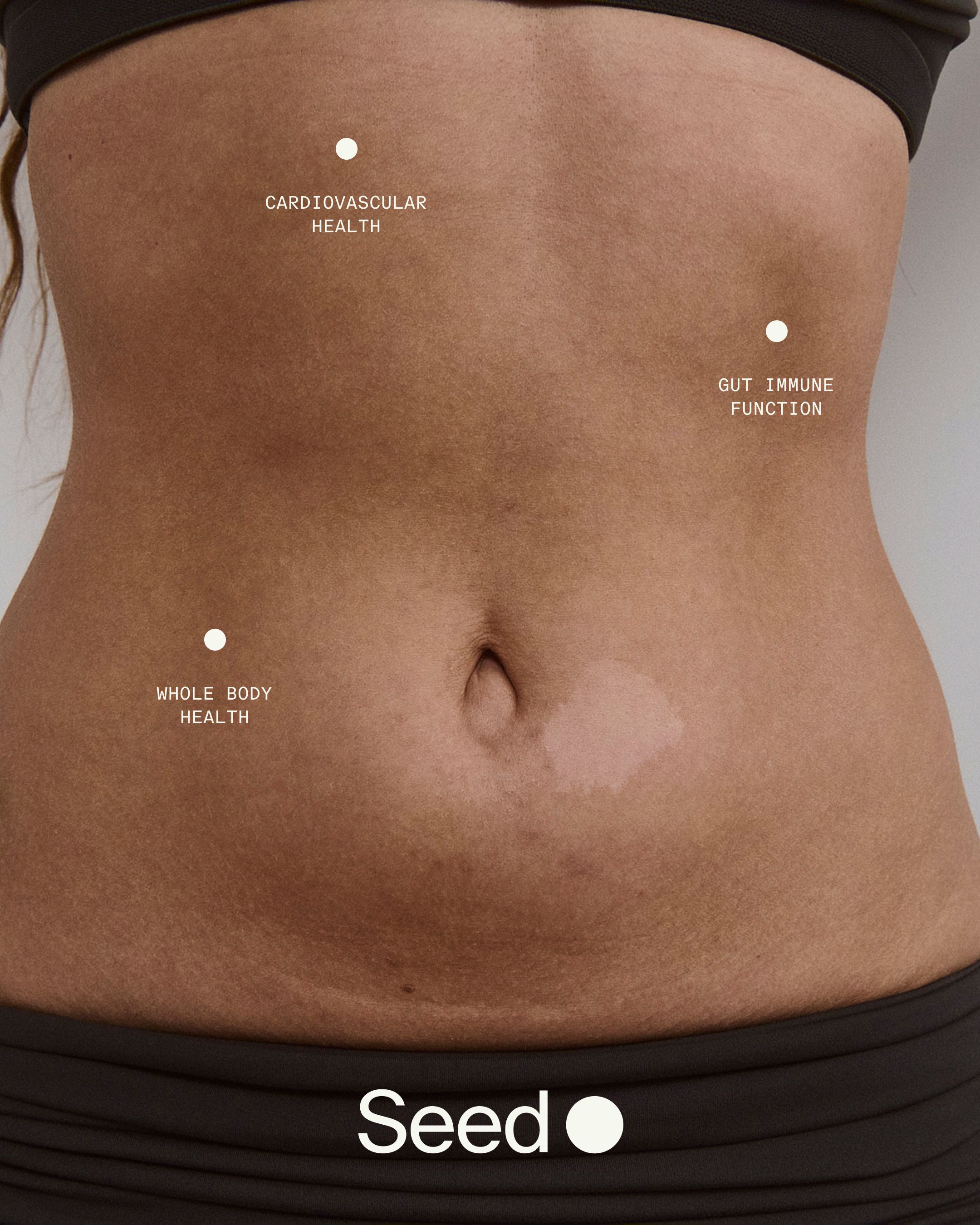
In collaboration with DCA Symphony in Tokyo, we took this evolution as a chance to stretch the identity across new dimensions. The result is a flexible, modular toolkit that balances clarity with expression and adapts across science, storytelling, and culture. The Seed dot, a longtime recognizable symbol, was reimagined as a storytelling tool, where it can now function as a lens, a portal, and a point of entry into deeper ideas.
The color system, once strictly minimal, was expanded using a scientific framework—drawing from Darwin's Nomenclature of Colour to introduce palettes tied to product categories while retaining the brand's iconic green. In collaboration with Dinamo, we developed a custom variable typeface called Seed Sans. Designed to mirror the microbiome's behavior, it expands to meet expressive moments and contracts to communicate with precision.
A unique character set, referencing scientific notation and the brand's capsule form, further reinforces Seed's identity. To bring the system into motion, we created a behavior-based framework built around three natural actions: Grow, Shift, and Transform. These movements establish an ownable rhythm across type, iconography, photography, and other brand elements.
From static to alive. From strict to scalable. From singular to systemized. A brand that feels as ambitious and adaptive as the science behind it. Ready to meet the moment, and whatever's next.
- Positioning, Narrative, Visual Identity, Creative Direction, Motion Design:Mouthwash Studio
- Positioning, Narrative, Visual Identity, Creative Direction, Motion Design:DCA Symphony
- Brand Strategy:Concept Bureau
- Custom Typeface:ABC Dinamo
- Visual ID Support and Icon Design:Moniker
- Typography Reel Motion Design:Lucas Hesse
- Motion Design Support:Mikey Kelly
- Photographers:Emily Rosser
- Photographers:Casey Zhang
- DP & Edit:Olivia Mae Eberstadt
- Photo & Video Production:Neighbors Brooklyn
- Photo & Video Production:Katie Binfield
- Typography Reel Score:Golden Hum
- Stylist:Camilla Pole
- Casting:Arielle Berman
- Product Rendering:Pedro Veneziano
- Seed Brand Team:Ara Katz
- Seed Brand Team:Charles Fulford
- Seed Brand Team:David Klein
- Seed Brand Team:Spencer Elias
- Seed Brand Team:Kat Kennedy